Account
New to ADSS? Open an
account now to get started.
Already have an account?
Add funds to your ADSS account
Account
New to ADSS? Open an
account now to get started.
Add funds to your ADSS account


Asset Watch
Tuesday, June 14, 2022
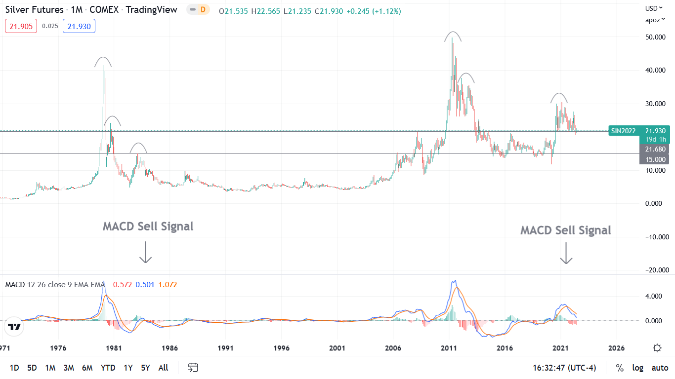
Silver’s monthly chart is eerily similar to the 1980s. For example, after recording a parabolic spike, silver cratered, rallied, cratered, rallied, and then a final swan song sent it below $10 for roughly 20 years. The arch symbols on the left side of the chart show how lower lows were present during each upswing.
Similarly, the arch symbols on the right side of the chart show how resistance materialised each time silver attempted to recoup its prior highs. More importantly, silver’s third and final leg down in the 1980s occurred after the MACD recorded a sell signal – which is depicted by the blue line at the bottom of the chart crossing the orange line from above.
Likewise, a sell signal is present today. So with the $22 range marking long-term resistance in 1980, 2008 and 2016, is silver poised to re-test $15? For context, the level coincides with the 1983 and 2006 highs and the low-end ranges from 2010 onward.
A cause for pause?
ADSS
8th floor, CI Tower
Corniche Road
PO Box 93894
Abu Dhabi
United Arab Emirates
Trading Services
ts@adss.com
+971 2 657 2414
Investing in CFDs involves a high degree of risk that you will lose your money due to the use of leverage, particularly in fast moving markets, where a relatively small movement in the price can lead to a proportionately larger movement in the value of your investment. This can result in loses that exceed the funds in your account. You should consider whether you understand how CFDs work and you should seek independent advice if necessary.
ADS Securities L.L.C – S.P.C (“ADSS”), a limited liability company – sole proprietorship company incorporated under United Arab Emirates law. Registered under Commercial License No.1190047. ADS Securities L.L.C S.P.C is regulated and authorised in the UAE by the Capital Market Authority (CMA) under Category 1 License No.305027 (Trading Broker, Trading and Clearing Broker, Trading Broker in the International Markets, Trading Broker of OTC Derivatives and Currencies in the Spot Market, Financial Products Dealer) and Category 5 License No.20200000217 (Introduction). Registered Office: 8th Floor, CI Tower, Corniche Road, P.O. Box 93894, Abu Dhabi, United Arab Emirates.
The information presented is not directed at residents of any particular country outside the United Arab Emirates and is not intended for distribution to, or use by, any person in any country where the distribution or use is contrary to local law or regulation.
ADSS is an execution only service provider and does not provide advice. ADSS may publish general market commentary from time to time. Where it does, the material published does not constitute advice, or a solicitation, or a recommendation to a transaction in any financial instrument. ADSS accepts no responsibility for any use of the content presented and any consequences of that use. No representation or warranty is given as to the completeness of this information. Anyone acting on the information provided does so at their own risk.